Crashes get the replay, and the mobile HUD goes quiet
Getting shot down bought you an eight-second death replay; flying into a hill bought you a jump-cut to the spawn screen. Now every death tells its story the same way — and while we were tuning the phone experience, we took three pieces of chrome off the mobile HUD that weren't earning their real estate.
The crash replay
The killcam has been one of the best-loved moments in the game: get shot down and you're handed the last several seconds of the fight, replayed from the killer's shoulder at full speed, ending in a slow orbit of your own wreckage. But it only played when someone shot you. Mush into the sea at the bottom of a dive and the game just shrugged: no replay, spawn screen, next. The two endings taught different lessons. One showed you exactly what happened; the other left you wondering how much altitude you really had.
Now a crash gets the same treatment. Auger into a hilltop and the camera chases your own six down into the scenery, then settles into the familiar orbit of the smoking hole you made. Every death tells its story the same way.
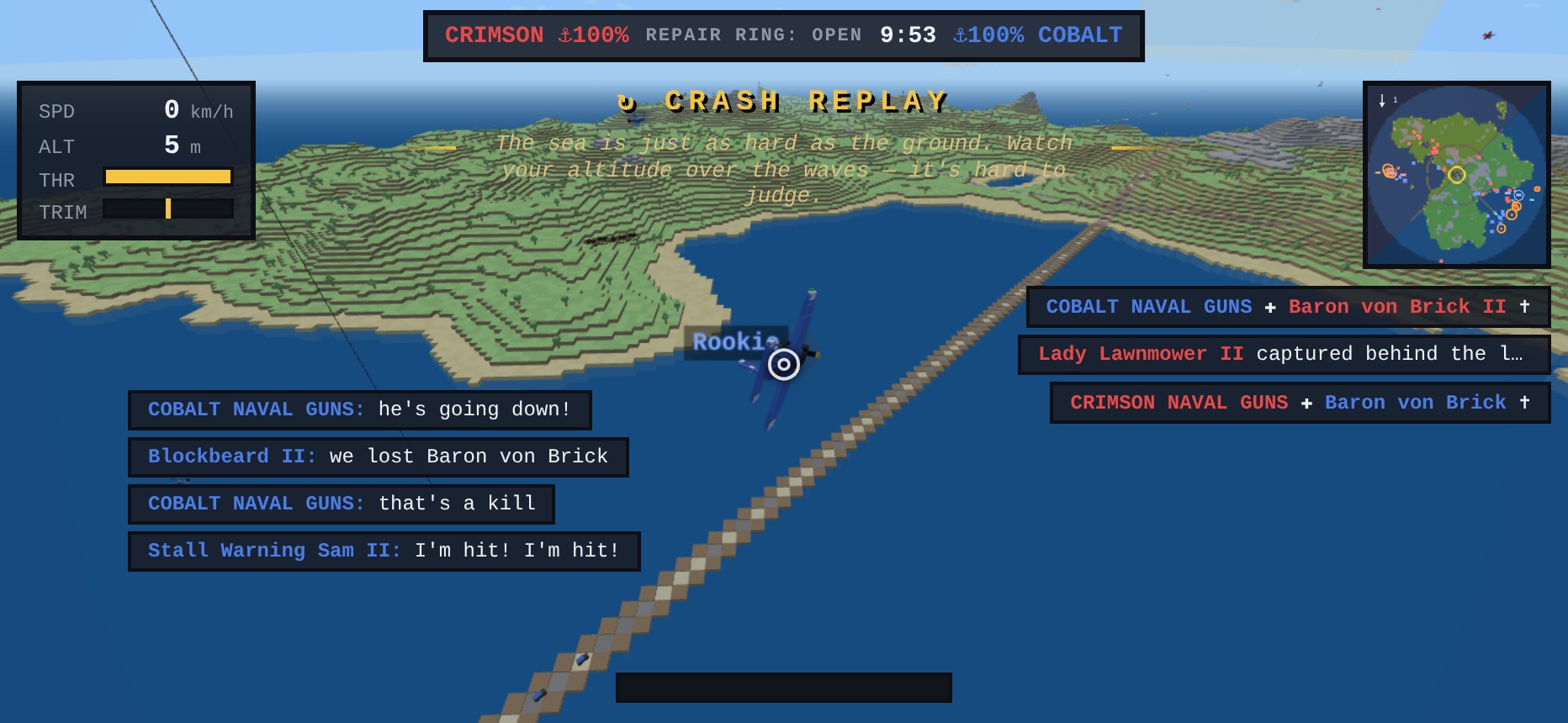
The badge tells the truth, too. A killcam brands the screen with the shooter's name for the whole clip; a crash has no one to credit, so the badge reads CRASH REPLAY and hands its second line to the death-recap coach — “in a dive, start the pull-out at twice the altitude you think you need” over the exact footage of you not doing that. The spawn screen still waits its turn, exactly as it does for a killcam, so the replay is never buried under the hangar card.
And it's optional. Every death replay — killcam or crash — now wears a quiet tap anywhere to skip line under the badge. Skip and the replay stands down, the hangar appears at once, and you're back in the air on the usual short cooldown. Watch your best deaths, skip your dumbest ones.
Three things left the mobile HUD
Phone screens are the most contested real estate in the game, and three pieces of chrome were squatting on it. The AP button toggled the straight-and-level autopilot — useful on desktop, where it has a key (P) and your hands leave the stick. On touch, letting go of the virtual stick already eases you back toward level flight, so the button mostly restated the default. The autopilot itself is still there — it just lives in a gesture now: double-tap the steering half to latch it (the centre AUTOPILOT flag shows it's engaged), double-tap again to take the controls back. Same feature, zero pixels.
The radio button opened the quick-chat comms wheel. Nice idea; in practice it sat in the busiest corner of the screen — above BOMB, under the killfeed — and got hit by accident about as often as on purpose. Desktop keeps the wheel on H; phones get the corner back.
And the gold aim cursor is gone from touch. Mouse players need a cursor — it's where their plane is going. On a phone that information already lives under your thumb: the stick knob is the deflection. Drawing a second gold glyph in mid-screen just put a floating bauble between you and the bandit. The centre of the screen now holds exactly one reticle: the white gunsight.
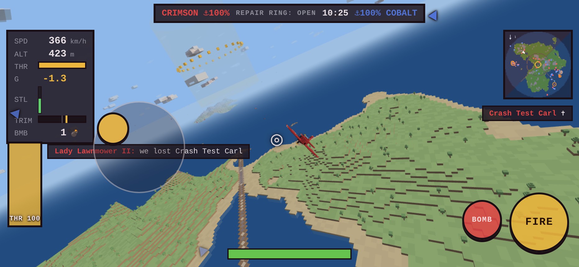
The space they vacated got put to work. The killfeed climbed up to sit flush under the minimap where the AP pill used to float. Chat — which used to stack eight lines deep down the left side, under the stick and behind the throttle slider — now caps at four lines on touch, fades sooner, and starts below the gauge stack, indented clear of the slider. Same information, none of it under your thumbs.
A phone HUD earns its keep one glyph at a time. If the game already says it — with the stick knob, with the instructor, with the killcam — the HUD doesn't have to say it again.